It’s here!
We’re so excited to announce the all-new RBCommons 2.0. This is a major update that improves the service in so many ways that we won’t be able to fit it into one post. It’s faster, more reliable, easier to use, and full of polish.
Let’s go over a few of the new features.
A super-charged diff viewer
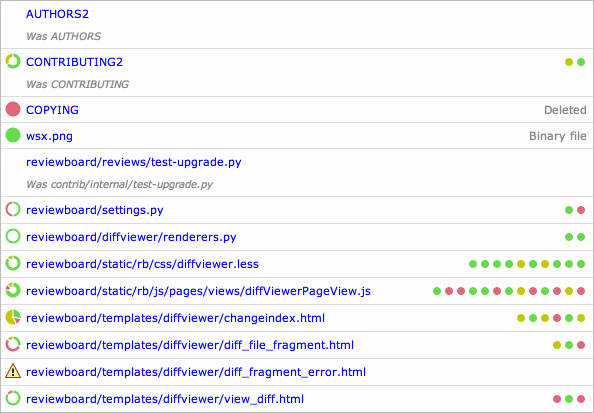
The first thing you’ll see in the new diff viewer is a new file index. At a glance, you’ll see not only what files were changed, but the complexity of the changes. The ring icons beside each file show the proportions of inserted lines, deleted lines, and replaced lines. The thickness of the ring shows how much of the file has been modified.
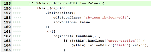
In most diff viewers, indentation-only changes look just like any other changes. You have to spend time checking to make sure that the content didn’t actually change along with the indentation.
Not here! Now, indentation-only changes are shown with little markers, which show exactly how many spaces or tabs were used. You won’t have to spend any time looking at whether the text in the line has changed. You’ll know at a glance.
We’ve also improved the quality of interdiffs (especially when dealing with merges), made moved line detection much smarter, and added an easy-to-use revision selector to quickly jump between diff revisions and interdiffs without reloading the page.
The new “New Review Request” page
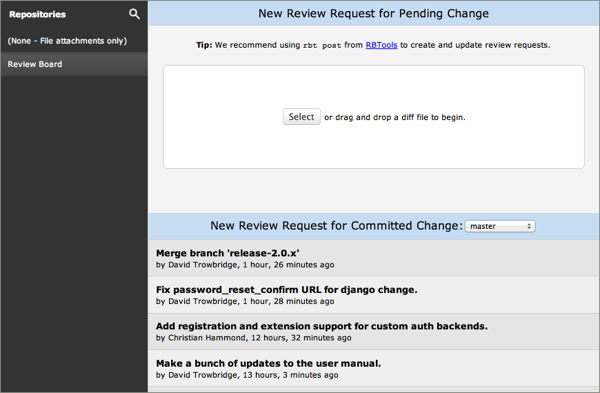
We’ve completely rewritten the New Review request page, making it simpler to upload your diff and check it for errors. We’ve also gone further and added one-click posting of committed changes for review. Simply select a branch, browse through your commits, and click to post. In seconds, it’ll be up and ready for review.
Detailed change histories
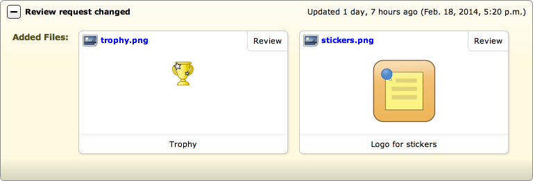
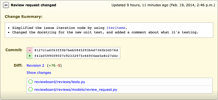
When you’re working on large changes with several iterations, it’s important to know exactly what changed. We’ve always provided change histories, but they were pretty basic. Now, they’re anything but.

A slicker dashboard
We cleaned up the dashboard navigation and layout to help you jump between your incoming and outgoing review requests. The sidebar is less cluttered and confusing, and actually useful.
We’ve also addressed two of our most-requested features: Issue counts in the dashboard, and batch closing of review requests.
The Ship It column now shows the number of open issues filed against a review request, if any. These always take precedence over any Ship Its, helping you know at a glance if there’s any feedback you need to address.

The all-new “Select Rows” column in the dashboard lets you select multiple review requests and close them in one go. It’s very useful when trying to clean up your dashboard if you’ve gotten behind in closing review requests, or if a former teammate leaves. Simply click the pencil in the top-right of the dashboard to add this column, and drag it where you want it.
Lots more!
This post is getting pretty long, so we’ll wrap it up. Basically, a lot has changed, and we only touched upon a few of the features. Some others include:
- Markdown support in all text fields
- Faster posting of review requests from RBTools
- Retina icons
- New support for reviewing different text-based file attachments
- Reviewers can close issues they filed
- Easy download of files in the diff viewer
In the coming weeks, we’ll go into more detail on some of the more useful additions in this release, including tips and tricks on how to get the most out of RBCommons 2.0.
This was a pretty major release, so if you have any issues, please contact us immediately so we can resolve them!