The dashboard. It’s the very first thing you’ll typically see when you log into Review Board. Outside of review requests and the diff viewer, you’ll spend most of your time here – but are you getting the most out of it?
Did you know that you could close several review requests at once? Or see which review requests were specifically assigned to you, or the number of lines added/removed in each diff, or the bugs addressed, all at a glance? How about being able to keep track of activity on groups you’re not a part of?
Let’s go through some of the ways you can make the dashboard work better for you.
1. Choosing what information to display
Take a look at the top-right of the dashboard, at the very last column. See that pencil icon? If you click it, you’re going to see a list of all the columns you can put on your dashboard. You can turn some on, turn others off.
Depending on how old your account is, you may be using an older default set of columns, meaning you’re really missing out on some handy columns.
Here are my favorites:
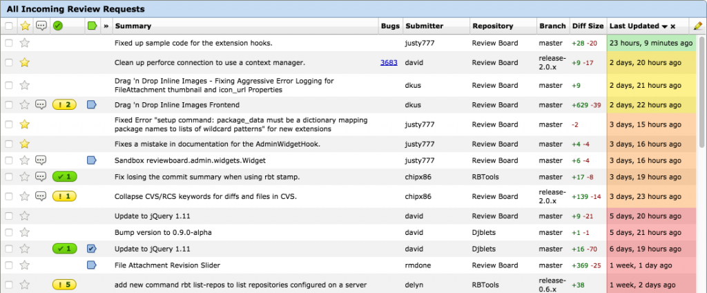
- Diff Size, newly introduced in 2.0 and on RBCommons, takes the latest diff on the review request and shows the number of lines added and removed. This gives me a good idea as to how long a review may take.
- My Comments is a default now, but it wasn’t always. This displays a handy icon showing if you’ve already reviewed a change, if that review is still a pending draft, and whether you’ve said Ship It! Super helpful for sorting through your workload.
- Select Rows, also introduced in 2.0 and on RBCommons, adds a little checkbox for selecting review requests. Selecting one or more lets you perform actions, which we’ll go into below.
- Ship It! is your way of knowing if reviewers have deemed a change ready to ship, or if there’s any issues to resolve (on 2.0+ and on RBCommons). Green checkmark for Ship It, and yellow exclamation point for issues to resolve. If you don’t have this column, add it now!
- Starred lets you click to star/unstar a review request. Starring is a way to keep tabs on the activity on a review request you’re not assigned to, CCing you on all e-mails and making the review request quick to find in the dashboard.
- To Me simply displays a little indicator (
») for any review request directly assigned to you. Usually a good place to start when deciding what to review.
Here’s how my dashboard looks:
2. Reorder your columns
Okay, now you have some new columns, and they’re all shoved to the right of the dashboard. That’s probably not where you want them. That’s okay, we can fix that.
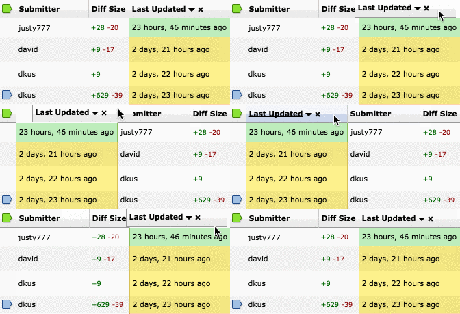
You can re-order columns by simply clicking and dragging the column header. Move it where you want it, and the dashboard will remember.

I like placing all the little icons (Starred, My Updates, Ship It!, My Comments, and To Me) toward the left, right before the summary. Play around, see what works for you. Go nuts.
3. Sort your columns
You now have a lovely set of columns exactly where you want them. There’s some timestamps in there, maybe the repository or branch names. Now’s a good time to learn about sorting.
Certain columns can sort their data. Most anything with text, like Summary, Branch, or Last Updated, can be sorted. When you click a column, it’ll sort in ascending order. Click again to sort in descending. Click the “X” to unsort that column.

There are two levels of sorting. Click a second column, and everything will be sorted by that. If two rows have the same data for that column, then they’ll be sorted by the previously clicked column.
To prioritize changes going into a release, click Last Updated and then Branch. You’ll quickly be able to see review requests grouped by branch, then sorted by when they were last updated.
4. Close many review requests at once
Is your dashboard getting a bit messy? Did you forget to close a bunch of old review requests, and just hate the thought of going through and dealing with them one-by-one? Or maybe you’re an administrator and someone just left the company with a mess to deal with.
Remember that Select Rows column from before? It gives you a nice little checkbox for each review request. When you start clicking those checkboxes, the dashboard’s sidebar will begin to give you a summary of the review requests, along with options to close them all at once. You can discard them, or mark them as submitted into the codebase.

In one go, you can clear away dozens of review requests, making everyone else on the team very thankful, and completely in your debt.
Speaking of…

Next time, we’re going to talk about how to keep your dashboard squeaky clean, without micromanaging review requests. You’ll learn how you can put an end to messy dashboards once and for all.
In the meantime, Happy Holidays everyone!


