This week, we’re going to dive into three major topics:
- DiffX, our proposed standard for a better Unified Diff format
- Our new in-house CSS Components standard
- The work being done on the Review Board Administration UI
DiffX
Unified Diffs, the most common type of diff files, are pretty lacking in standards. Nearly every type of source code management solution outputs its own version of a unified diff, shoving metadata into it however the developers saw fit. This frankly makes it a pain to work with diffs in Review Board, and I’m sure anyone else building similar tools can say the same thing.
A few years ago, we jotted down some ideas of what we’d like to see in diffs. We wanted:
- A superset of Unified Diffs that’s fully backwards-compatible (no way would a new diff format gain traction if existing tools couldn’t use it)
- A format that could be reliably serialized/deserialized (complete with metadata and file contents) as easily as something like JSON without writing a parser for a dozen different variations of the format
- Information on the encodings of a diff file and of the contents of a file, so we no longer have to guess
- Changes across multiple commits in a single file
- Some standard way of representing changes to binary files
We feel this is important. You wouldn’t believe how wildly different two diff files can be, and how broken most are (just having spaces in a filename means you’re going to run into all sorts of crazy problems).
So we put these ideas together and called it DiffX. Our plan was to build a specification, a standard Python library (and later libraries for other languages), and RBTools/Review Board support.
This week we put up the initial draft of the DiffX specification and documentation. Take a look. See what horrors tools like ours go through, and what we’d like to do about it.
Do you work on another code review tool or source code management system? Let’s talk!
Note that this is still a work-in-progress, and we have a lot we need to better formalize the parsing and the metadata format (and make a public, useful reference implementation).
CSS Components
During Review Board 4.0 development, we kept running into clashes between CSS rules, and had to deeply nest CSS classes and elements in order to ensure our styles would apply. Yuck. This was not sustainable.
We sought to fix this for our code, and looked into what others have done. We considered BEM, BEMIT, and a few other approaches. None felt quite right for our needs (particularly since we want to avoid clashes between third-party extensions).
So we took what we liked in each and drafted our CSS Component Style Guide.
This gives us a better way of thinking about what goes into our stylesheets and HTML pages. We think in terms of formal, reusable components, instead of just haphazardly tacking on styles for whatever HTML we’re writing.
We group together LessCSS variables (used for colors, sizes, etc.) and macros (for customizing a component’s presentation in a safe way) under organized namespaces. Stylesheets (ours and extensions’) that are looking to fit in with our styles or specialize a component can rely on these to better fit in.
We’re also taking care to add formal documentation for everything we add, which forces us to think about our styles, reason about them, and support them.
Want to see this in action? Here’s a few examples:
We’re still working on moving over to this, writing all new CSS using this standard and migrating old styles as needed. This is a long-term project, but we thought it might be interesting to some of you.
If you’re developing extensions for Review Board, we encourage adopting these new styling conventions. It’ll make your life so much easier.
The New Administration UI
Last week, we talked about the work on Python 3 and Django 1.11, and some of the huge tasks we’ve had to work through to support this.
One of the large — and final — hurdles is our administration UI. Django helpfully provides a built-in administration UI that projects get out of the box, and it’s very useful. And we extend and customize it heavily.
The problem is that Django’s administration UI has changed a lot since 1.6, and frankly it wrecked ours. So we’re rebuilding it, better than it was before.
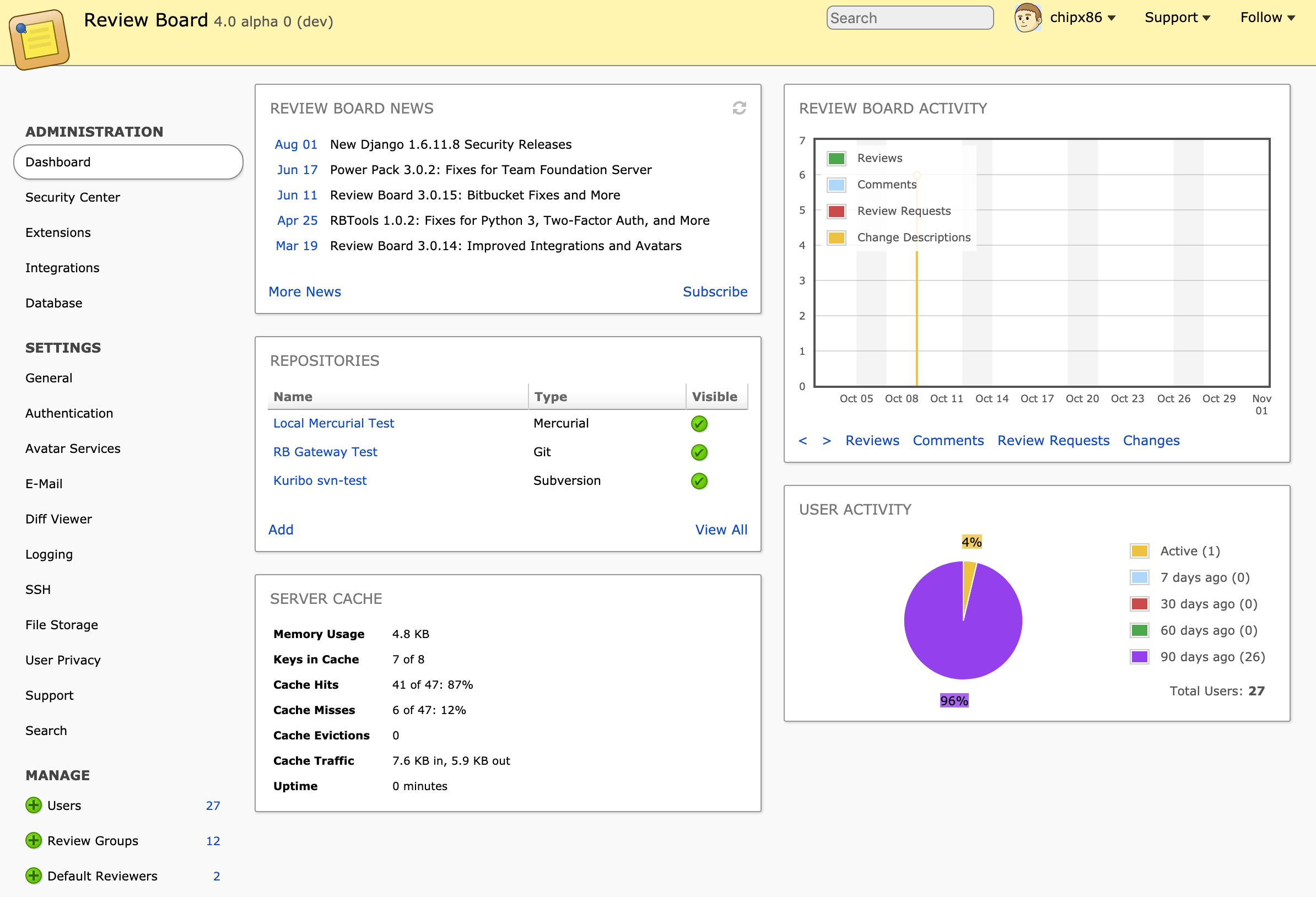
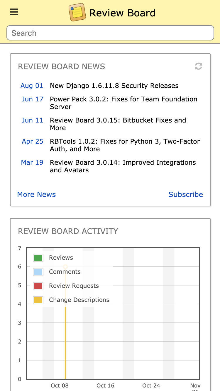
Here’s a breakdown on the new UI:
- It’s mobile-friendly
- Organization is now much more clear — all navigation is in the sidebar, not split between sidebar and the top header bar
- The administration dashboard widgets are so much better — larger, less cluttered, faster, and trimmed down to only the most useful widgets
- It’s completely our own, no longer dependent on Django’s rendering, so future upgrades will be smoother
It’s also built with our new CSS component standard, and introduces new components that we can use throughout the product. Extensions can take advantage of these, too, helping them look like a native part of Review Board without worrying too much about our styling.
Here’s a couple in-progress screenshots.
Next Week
We’ll go over some of the new diff functionality being worked on in Review Board 4.0, and what we’ve been up to in RBCommons land.
Again, if you have any questions, or anything you’re curious about and want us to cover, please reach out on our community forum.


