PDF Review Beta

A little while ago, we announced that we were building document review features for Review Board. This will be available as a commercial extension in order to help fund the project. Of course, once it’s ready, RBCommons customers will get it as part of their normal plans. I’d like to show off a bit what you’ll be able to expect.

Since Review Board 1.6, you’ve been able to attach arbitrary files to review requests. For anything except images, the only way to view them was to download them. You could add general comments to these files, but for large things like a document, you couldn’t use the direct commenting that we’ve all come to love from the diff viewer.

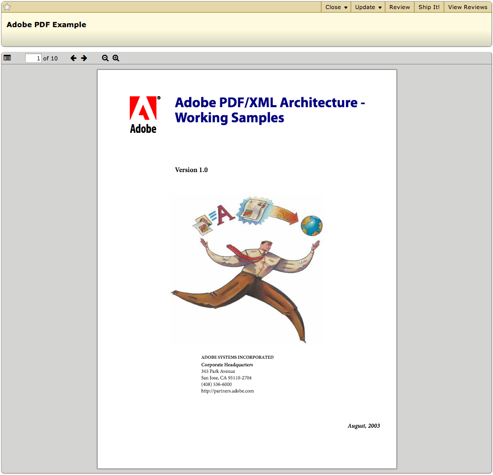
With the PDF Review extension, when you upload a PDF file, it gets a thumbnail and a “Review” link.

review-request

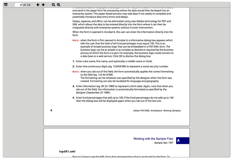
Clicking on this file will open up the PDF Review UI, which has controls to navigate the document. The file is rendered directly in the browser with no plugins (which requires a relatively modern browser).

pdf-viewer

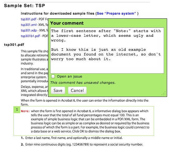
Like image review (and screenshots before it), you can add a comment to the document by clicking and dragging over the area that you’d like to talk about.

adding-a-comment

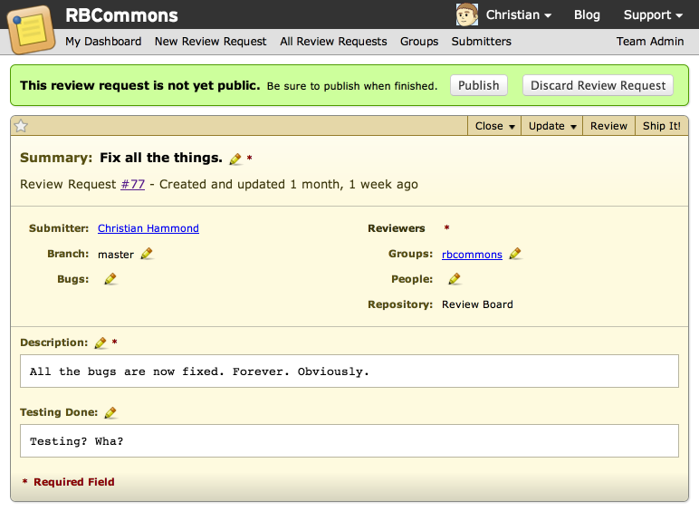
When you publish, the areas that you selected will be copied into the review along with the page number on which they occurred.

review

If you signed up for the beta program already, you should have received an email with instructions on how to install and activate this extension. If not, feel free to sign up and we’ll get in touch!

Read More

Making RBCommons more inviting

We’ve just deployed a change that makes it much easier to get your team set up on RBCommons. Until now, if you wanted to add a new user, you’d have to register an account first, and then add the username in your team administration dashboard.

Going forward, instead of registering an account first, you can just add the email addresses of each of your teammates. They’ll get an email with a special sign-up link, and once they create their account, they’ll be automatically added to your team.

admin-users

As usual, if you have any questions or comments, feel free to get in touch.

Read More

RBCommons: New and Improved

Tonight, we deployed a major update to RBCommons that brings with it an improved look and feel and an assortment of new features.

RBCommons, as you may know, is powered by Review Board. Historically, we’ve used Review Board 1.6 under the hood, but now we’re on 1.7, the latest and greatest.


Shiny!

The first thing you should notice when you next log in is that there’s a cleaner, smoother feel to the site. Fewer sharp edges. More consistent font sizes. We’ve strived to bring more consistency and to shed a lot of our older warts. This will only get better from here on out.

As an example, look at how a review request used to look:

Old Look and Feel

Compared to how it now looks:

New Look and Feel


Improved Issue Tracking

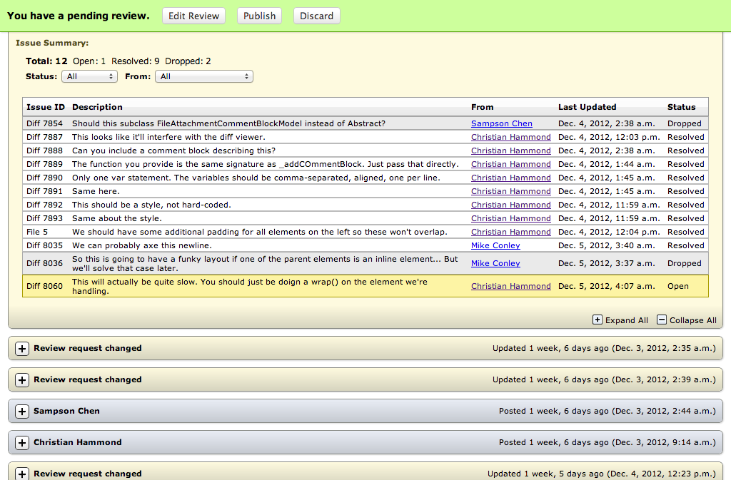
It can be hard to keep track of all the issues your teammates want you to fix, especially if there’s a lot of reviews. Sometimes things just get missed. That would happen to us, at least, so we decided to fix it.

A summary of all opened issues is now shown right on the review request, making it easy to see how much work you have to do. You can filter the list or jump down to the relevant comments with one click.

Issue Summary Table


Moved Files in Diffs

If you’re using RBCommons with Git or Perforce, we’ll now show your moved files intelligently, instead of one big delete and one big add. That means you can move a file, make some changes, post it for review, and you’ll see those changes show up. Much easier to review!


Better File Attachments

We used to support uploading both screenshots and arbitrary file attachments, and you had to tell us which it was. Pretty ugly. It’s much simpler now. Just drag-and-drop your file onto the review request, and it’ll be attached. We’ll even show a preview of the file if we can (currently this supports images, MarkDown files, ReStructured Text files, and generic text-based files).

Just like before, you can review images, just like diffs. We’re going to be adding this ability for other types of files in the future.


Like it? Hate it? Have questions?

Let us know!

Read More

Adding Multiple Team Admins

We always had the ability for your team to have multiple administrators, but that’s been something that we’d have to set for you. This has been one of our more common requests as of late. So we’ve made it easy for you to assign new administrators to your team.

In your Team Admin page, you’ll now see a little pencil next to each of your users. Click the pencil and you’ll see a dropdown with an Administrator checkbox.


Assign an administrator


Guess what happens when you check it?

Read More

Announcing Default Reviewers

Find yourself typing the same reviewers over and over, for every new review request? Us too. You don’t have to deal with that anymore.

Administrators can now decide what groups or users will be assigned by default for new review requests. There’s a lot of flexibility here. You can determine the default reviewers based on file paths (which are based on regular expressions), and these can be configured across all repositories or just one or two. Create as many configurations as you want for all your needs.

To configure these, just go into your Team Admin page and click Default Reviewers on the left, then Add a default reviewer.

Tip: If you’re a small team, you can have all new review requests automatically assigned to a group. Just:

  1. Add a default reviewer.
  2. Leave your list of specific repositories blank. This way, it’ll apply to all of them
  3. Set the File regular expression field to: “.*” (without the quotes)
  4. Choose your group and save.
  5. Post a review request to test it out.

If you have any questions on configuring these, contact us at any time.

Read More

Announcing Easy Plan Changes

As RBCommons grows, more and more of you have grown with it, and have outgrown your old plans. While we’re just an e-mail away (say hi sometime!) and have been happy to switch your team to more roomy plans, that’s just frankly taking up more of your time than you deserve.

Starting today, you can switch your team’s plan on the Account and Billing section of your Team Administration page. Just find the plan that best suits your needs and click Change Plan. After a few seconds, your team will be all set with the new plan. You can change at any time, and your account will be prorated for the month.

Of course, you’ll only be able to switch to a plan that’s big enough for your team.

If you’ve discussed an educational plan with us for a class, please contact us before switching your plan.

Read More

Improving Team Administration

We just landed a large and improved change to the Team Administration pages that we hope will make things much easier for you administrators out there. We had a couple main focuses:


Navigation and Layout Improvements

Understanding and navigating the Team Administration section is now a breeze. We’re no longer showing all your information and configuration on one long page. Now you’ll have a clear list of administration pages you can access, which are listed on the left-hand side of your administration pages.

We’ve modernized the style of Team Administration pages to both be less bland and to be more consistent and clear. You’ll see improvements across all your pages. For example, the list of users in your team will show their gravatars, if they have one set, while the Account and Billing page will give you a clear display of the important information on the credit card you have on file and will clearly display if your card has expired.


Payment History

A very common request was to make it easier to see your past payments. We send out e-mails with this information every month, but it’s handy to be able to look it up, especially if an e-mail ended up in the spam folder by mistake.

You’ll now find a handy “Payment History” page showing every month’s payment you’ve made since signing up for RBCommons. Clicking on the link for the month will show you the invoice for that payment.

There’s still some work to do here. We’ll be rolling out coupon/discount information in your invoices soon, for those who have had coupons applied to their accounts.


Easier RBTools Configuration Info

We used to have a section on the Team Administration page showing you roughly what was needed for an RBTools (post-review) .reviewboardrc file. It was per-team, though, and not per-repository. We’ve fixed that. Go to your Repositories page, and you’ll see an “RBTools Configuration” button next to each repository with exactly what information is needed to set it up with post-review.


Coming Soon…

We have a few more changes that will be trickling in over the next month to make it easier to create new groups, invite users, and generally get set up.

Read More

2012 End of Year Sale!

We’ve had a pretty good year, and to celebrate, we’re throwing a sale!

Through the end of the year, if you sign up for a new Small, Medium, or Large plan, you will receive 50% off the price for 3 months.

If you’ve signed up for a new plan in the past month, we’ll give you the new sale price. If you’re already a member and want to upgrade, we’ll give you the discounted price for your upgrade.

There’s never been a better time to give us a try, so take a look at what we have to offer and sign up today!

Read More

Site update: Faster pages, new features

Tonight. we deployed a major update to the underlying Review Board code that powers RBCommons. We’ve been holding off on updating in order to get some widespread testing for some pretty significant speed improvements we made, and I’m pleased to say they’re ready.


Speed!

This is the first thing you can expect when you next use the site. It should be a lot faster. We’ve sped up every page, and you’ll see the biggest differences when loading review requests (long ones in particular) and the diff viewer.

The smarts of the diff viewer have been improved, so we better handle very large diffs and diffs with very large lines. This used to take forever, but not anymore!

We did some performance testing on these new changes and saw some crazy drops in page render times. Average sized review request pages went from ~500ms to ~180ms. Large ones with dozens of reviews dropped from ~3 seconds to ~300ms. Diffs saw savings of a few seconds on average, or in pathological cases, as much as a minute.


Smart timestamps

Every time we show a date or time on a page now, you can always be sure that it’s relative to now. Sit and stare at a page for a few minutes and you’ll see time tick away.


Incremental diff expansion

This is my personal favorite new feature. Our diff headers (the brown parts that show the function or class name) have just gotten much more useful.

We now have little expand buttons on these headers. You can expand the diff by 20 lines at a time, or all the way up to the displayed function or class. Or you can still expand the whole thing if you need to.

This is one of those small things that should save you a lot of time.


Bug fixes galore

This update also comes with dozens of bug fixes. Many of these fix compatibility issues we had with certain types of diffs. A few highlights:

  • Git diffs with binary files, Subversion diffs with property changes, Mercurial diffs with spaces in the filename are all now working.
  • Subversion diffs that had broken $Keyword$ fields don’t break in the diff viewer anymore.
  • Git diffs created with format-patch no longer have their extra information (such as a commit description) stripped after uploading.
  • Better support for Mercurial, particularly on Google Code.
  • When using Parent diffs, new files are no longer styled wrong in the diff viewer.
If you run into any new problems, contact us and we’ll work to address them quickly.

Read More